Idea
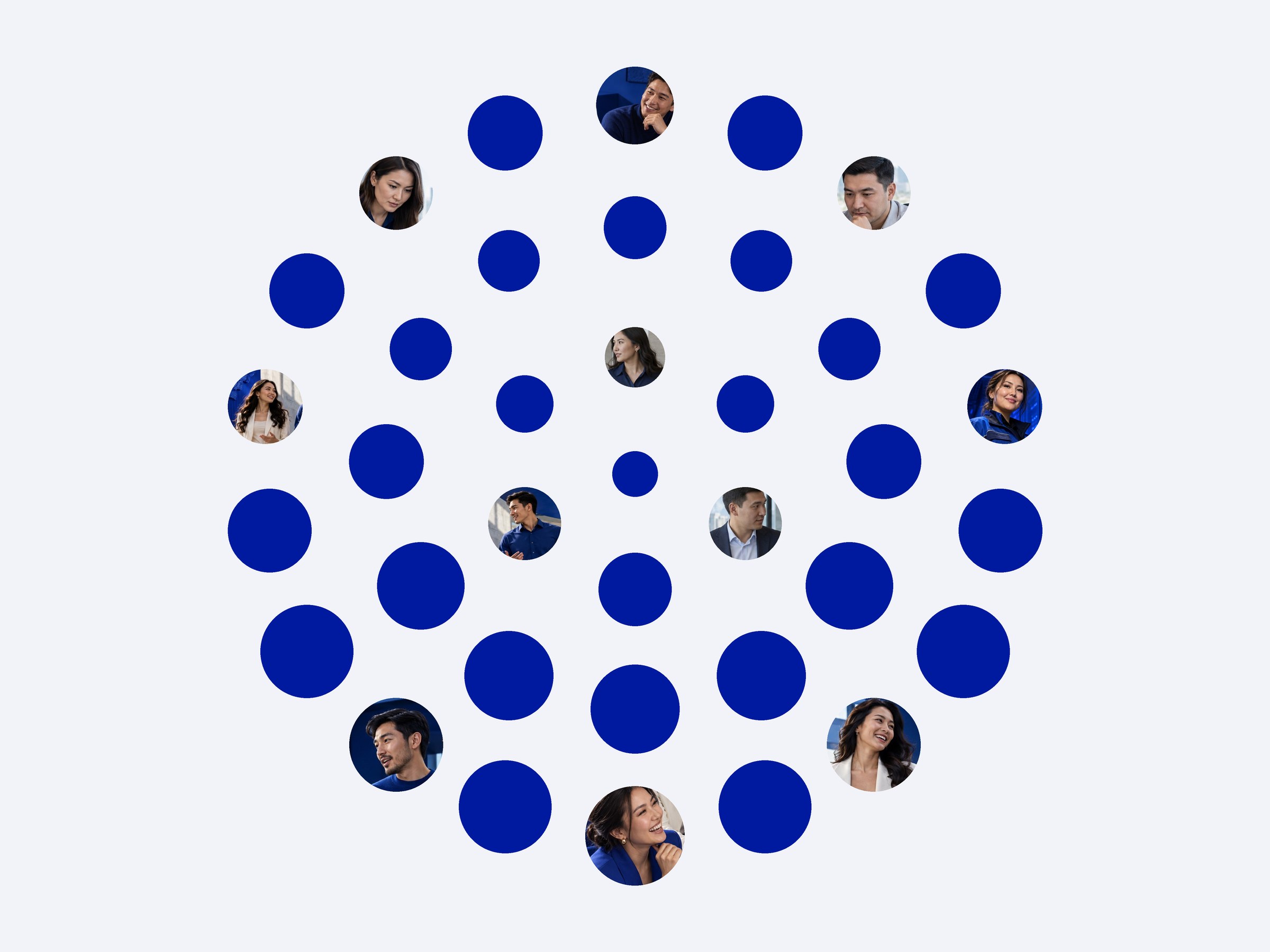
A telecom operator does one thing: it connects people. So every dot in the mark is a person, and the mark is 37 of them joined into one form. Every dot is a person. QMobile connects them.
Meaning
Fill the dots with faces from the brand’s own photos and the mark still holds its shape. It is not a globe or a signal icon. It is people who found each other.
Mark
Thirty-seven dots in rings, smaller toward the centre, so a flat circle reads as a sphere, like the planet the network covers. In glass, the same dots become lenses that catch the light one by one.
System
One colour carries the brand: Deep Sapphire, with a dark and a light background beside it. One typeface, Geologica, writes Kazakh, Russian and English.
The same dot builds the patterns, and the icons share its line.
#001A9F
#121A29
#F2F3F8
Мүмкіндіктерді
тоғыстырамыз
World
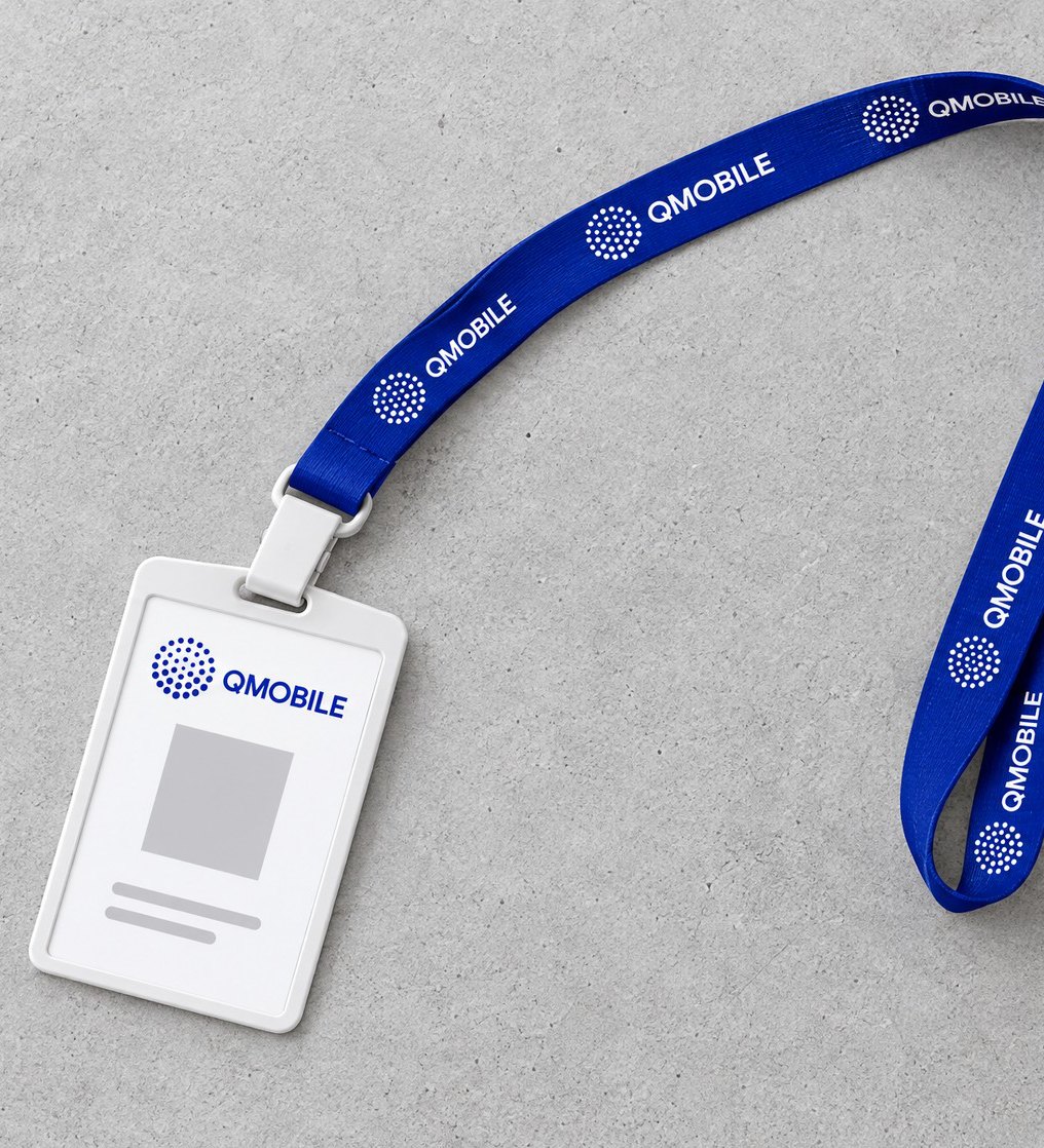
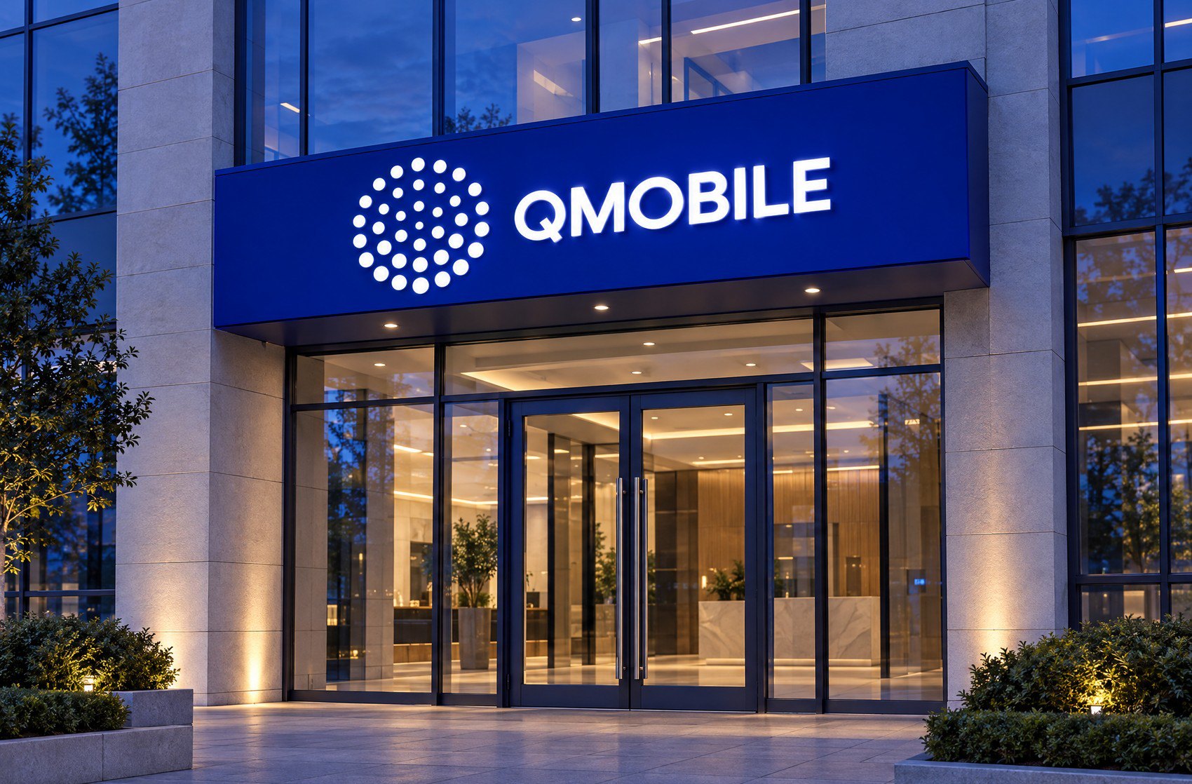
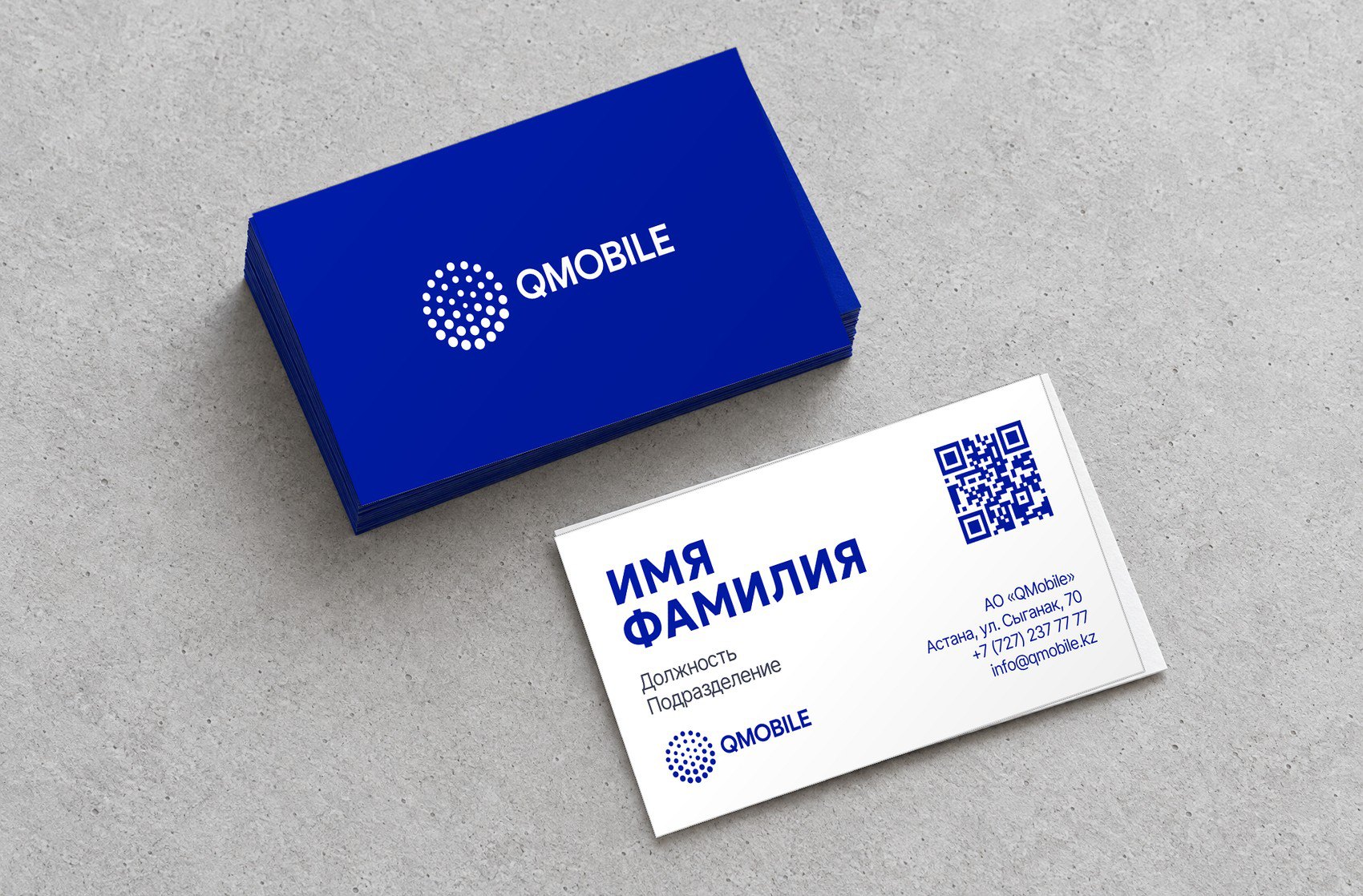
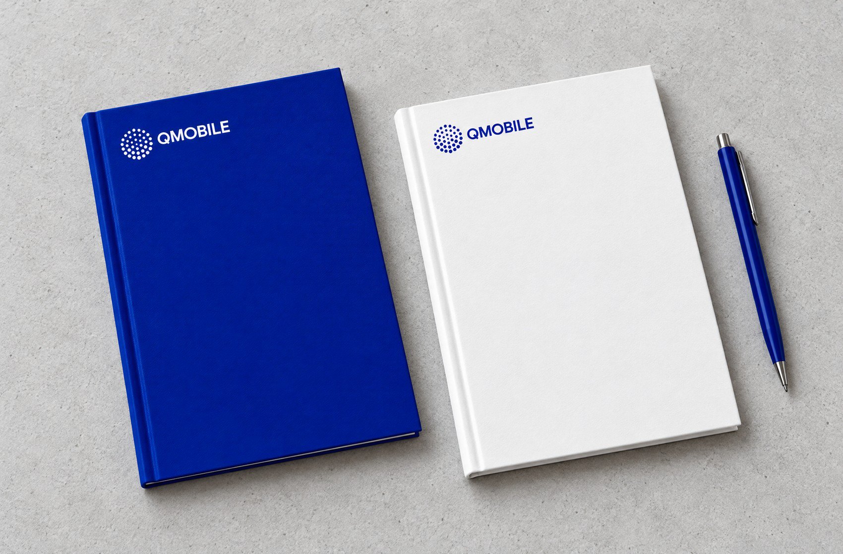
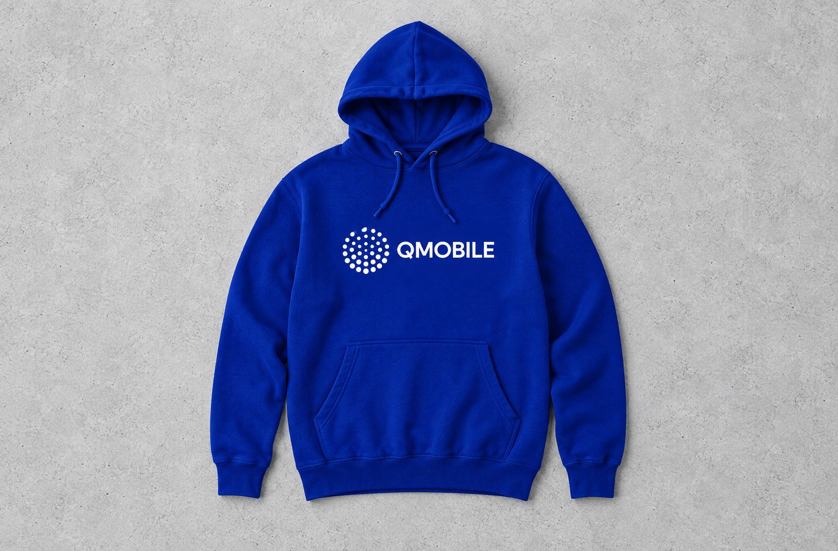
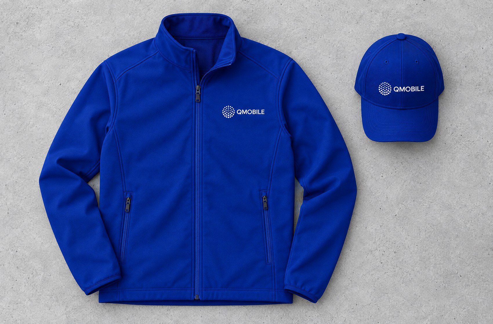
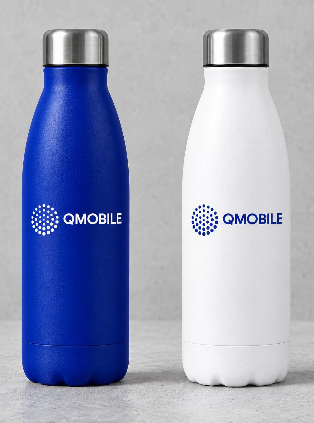
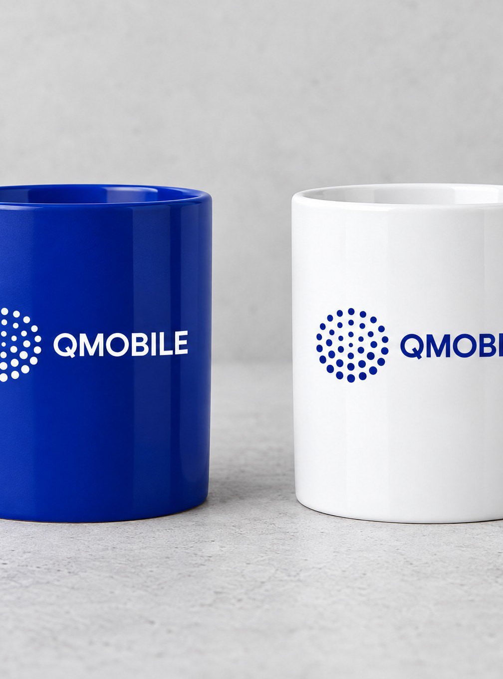
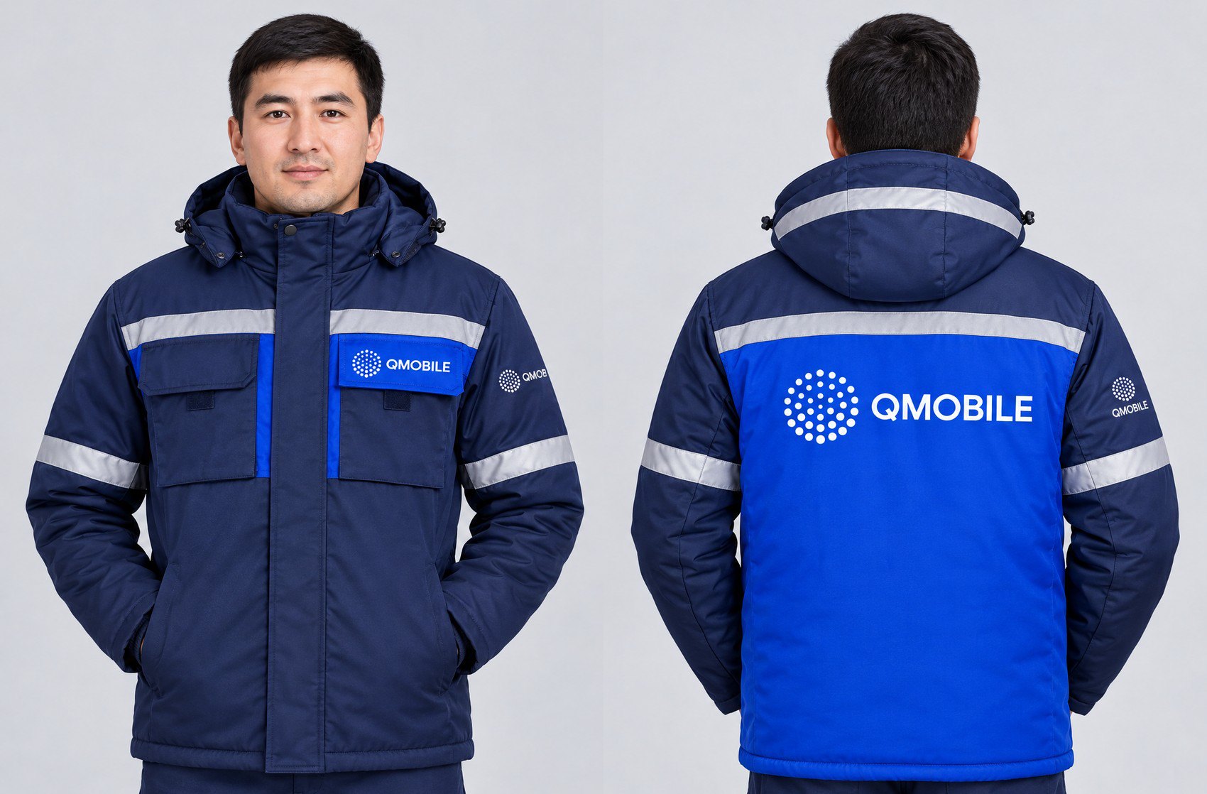
Then the dots leave the screen: a facade, a reception wall, cards and badges, merch and winter workwear. The mark stays the same 37 dots, and a 103-page guide keeps it that way.

Result
A new name with one visual language, from a business letter to workwear. The case film tells the whole story in one shot.
Logo, 103-page brand guide, corporate badges: Ulagat Tolepqazy, sole designer. 2026.